Building Aesthetic Color Systems: A Practical Guide to Palette Generation
We've all been there: you spend three hours tweaking a hero section or dashboard interface, only to realize the text looks washed out, the button feels aggressive, and the overall design lacks cohesiveness. Designing with color is notoriously tricky. It's not just a matter of selecting shades you like; colors must interact with each other in structurally sound ways to preserve readability, guide the user's eye, and build trust.
An aesthetic color palette generator takes the manual guesswork out of this equation. By anchoring random generation within geometric color-wheel relationships and lightness/saturation bounds, the tool provides immediate, harmonized color schemes. Whether you're planning a minimalist landing page, drawing illustration assets, or building a heavy data layout, here's how to structure a cohesive color system that looks premium and functions beautifully.
The Geometry of Harmony: Understanding Color Wheels
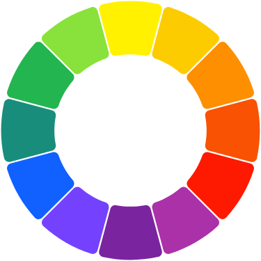
Sticking random colors together is a quick path to visual clutter. Reliable design frameworks rely on geometric offsets on the color wheel. The generator uses HSL (Hue, Saturation, Lightness) space to calculate these intervals automatically:
1. Monochromatic Palettes: These take a single Hue value and vary only the Saturation and Lightness. Monochromatic schemes are clean, highly unified, and practically impossible to mess up. They form the basis for elegant, modern SaaS dashboards where content hierarchy is key.
2. Analogous Palettes: Built by grouping three to five colors that sit side-by-side on the wheel (separated by roughly 20 to 30 degrees). It mimics the gentle transitions seen in nature—like a beach sunset or leaf gradients. It feels calm and organic.
3. Complementary Palettes: Created by pairing colors directly opposite each other on the color wheel (180 degrees apart). Because these colors clash strongly, they create intense contrast. Use one color as the dominant backdrop and reserve its complement strictly for accent elements—like your primary "Register Now" button or notification badges.
4. Triadic & Tetradic Palettes: Triadic schemes draw three colors spaced evenly at 120-degree intervals, forming an equilateral triangle. Tetradic (or double complementary) schemes use two sets of complements. These are vibrant and playful, but require careful handling—let one color dominate and use the others in minor accents.
The 60-30-10 Rule: Structuring Your Color Hierarchy
Once you have generated a beautiful 5-color palette, how do you apply it to a user interface? Professional designers swear by a simple mathematical distribution: the 60-30-10 rule.
- 60% Dominant Color (The Canvas): Typically your background, card wrappers, and structural layouts. This should be a neutral, non-intrusive shade—either soft off-white, light gray, or deep charcoal/black if building a dark mode.
- 30% Secondary Color (The Structure): Used for text, input fields, borders, navigation elements, and passive button states. It defines the structure and gives the site its main visual personality.
- 10% Accent Color (The Action): Reserved exclusively for interactive elements like links, primary buttons, icons, or notifications. Limiting your active accent ensures it stands out immediately to the user's scanning eye.
Contrast checking (WCAG 2.1) and Accessibility
An interface is useless if users can't read the content. The Web Content Accessibility Guidelines (WCAG) dictate strict contrast ratios to accommodate low-vision users. Our tool's built-in contrast checker automatically evaluates the relative luminance of text against each background color:
- Level AA requires a minimum contrast ratio of 4.5:1 for body text, and 3:1 for large text (above 18px bold).
- Level AAA demands a tighter contrast of at least 7:1 for body text.
When building layouts, always test text legibility first. If your primary accent fails Level AA contrast on white, darken it slightly using our lightness slider or switch your text color from white to black on top of that specific color block.
Frequently Asked Questions
Q: How does the "Extract from Image" tool work?
When you drop an image, the tool draws it to a hidden canvas and samples the pixel grid. It clusters similar RGB coordinates using spatial color distances to identify the five most dominant, visually distinct tones. This is run entirely locally in your browser, keeping your data private.
Q: Can I export my generated palettes straight into my code?
Yes. Under the Export tab, you can instantly copy the palette as standard CSS Variables, SCSS variables, a JSON array, or a Tailwind CSS configuration file theme object.
Q: What is the HSL model and why is it preferred for adjusting palettes?
HSL stands for Hue (the color wheel angle), Saturation (the richness), and Lightness (the bright/dark value). HSL is extremely intuitive for human design: to make a color pastel, you increase lightness and lower saturation. Doing this in RGB or HEX is nearly impossible without computational arithmetic.